Many can agree that artists and designers always seem to have a good eye for things – that they have a great intuition for aesthetics. It’s as if they have an internal sense of what appeals to our visual senses. What is it that they tap into that allows them to create great works of art or design? What is it that drives our attraction to their art or designs? Is there a common denominator between artists and designers that allows them tap into an aesthetic experience? Is there scientific reason that can explain why we like beautiful things? According to some, there is.
A new field of research is emerging that studies the science of the aesthetic experience – neuroaesthetics. The objective of which – to determine the neural mechanisms of aesthetic experiences. Using techniques such as fMRI (Functional Magnetic Resonance Imaging) or MEG (Magnetoencephalography) allow researchers to study neural activity in the brain while participants perform certain tasks. This approach has revealed that aesthetic experiences involve brain processes related with perception, memory, understanding, attention, emotion and pleasure.
A study done by neuroscientist Vilayanur S. Ramachandran and philosopher William Hirstein theorized that there are indeed neural mechanisms that mediate the artistic experience. In their paper The Science of Art – A Neurological Theory of Aesthetic Experience (1999), Ramachandran and Hirstein propose a list of “Eight laws of artistic experience – a set of heuristics that artists either consciously or unconsciously deploy to optimally titillate the visual ares of the brain”. Ramachandran would later go on to add two more principles to the original eight.
They are as follows:
1. The Essence of Art and the Peak Shift Principle
2. Perceptual Grouping and Binding
3. Isolating a Single Module and Allocating Attention
4. Contrast Extraction
5. Perceptual Problem Solving
6. Symmetry
7. The Generic Viewpoint and the Bayesian Logic of Perception
8. Art as Metaphor
9. Repetition, rhythm and orderliness
10. Balance
Can these 10 principles be applicable to visual communication design? Let’s take a look.
1. The Essence of Art and the Peak Shift Principle.
The concept of the peak shift principle lies in an artists attempt to capture the very essence of something in order to evoke a direct emotional response. This is accomplished by amplifying what makes something unique, highlighting the essential features and reducing any redundant or irrelevant information.
Ramachandran and Hirstein studied this effect via animal discrimination learning. In their study they note the following:
If a rat is taught to discriminate a square from a rectangle and rewarded for the rectangle, it will soon learn to respond more frequently to the rectangle. Paradoxically, however, the rat’s response to a rectangle that is even longer and skinnier is even greater than it was to the original prototype on which it was trained. This curious result implies that what the rat is learning is not a prototype but a rule, i.e. rectangularity. […] this principle holds the key for understanding the evocativeness of much of visual art. We are not arguing that it’s the only principle, but that it is likely to be one of a small subset of such principles underlying artistic experience.
This effect can be applied to human pattern recognition and aesthetic preference. Cartoonist characters are a good example of this. By overemphasizing certain characteristics of a persons face, cartoonists, in effect, amplify what is unique and reduce other aspects of the character they draw creating a caricature relative to the true image.
Backbone Creative’s package design for Bzzz Armenian Honey clearly demonstrates the peak shift principle. We find the package attractive because of its aesthetic essence of a highly stylized beehive which, in nature, tend not to have such exaggerated proportions. They have effectively used the principle by amplifying the characteristics associated with what we perceive as a beehive.
2. Perceptual Grouping and Binding
Perceptual grouping is the idea of being able to delineate a figure/object from a background. It is the ‘aha’ sensation we get when we discover a figure within a noisy background. Think – finding the chameleon in the forrest. We are able to separate the figure of the chameleon from the tree it sits on or the trees behind it. This may have evolved from our necessity to distinguish predator from prey while scanning a landscape. This is achieved with visual areas of the brain that are able to distinguish visual attributes such as motion, colour, depth, form, etc.
Sagmeister and Walsh's identity design for the Seed Media Group is a good example of perceptual grouping and binding. In their business cards, figures can be distinguished out of a dot pattern. Each card has a different set of colours within the pattern to delineate the identity of that particular individual. First glance, to many, may not reveal the figures immediately, however after a second or third glance, our brains are able to group dots together to reveal the figures.
3. Isolating a Single Module and Allocating Attention
Isolating a single visual modality, such as motion, form or depth, allows the brain to focus or allocate more attention to the output of that modality. This is where an outline drawing or sketch of an object can be more effective as ‘art’ than a full colour photograph.
Directing focus towards one modality allows one to notice the ‘enhancements’ introduced by the artist – allowing to more effectively enjoy the peak shift effect.
Paula Scher’s poster design for the AIGI’s 30th anniversary is a great example of isolating. By isolating the shapes and creating simple icons of the eye, heart and Empire State building, she immediately focuses our attention to the essence of these icons and is able to communicate a message without any extraneous information.
4. Contrast Extraction and Reinforcing
Artists and designers are familiar with the idea of contrast. It occurs between dissimilar features that are physically close together. Objects in an image can have contrast based on aspects of colour, size, shape or texture. Our visual system allocates attention to these contrasting regions due to the information shift or change.
Cells in the retina, the lateral ginculate body or relay station in the brain, and in the visual cortex respond predominantly to step changes in luminance (think edges) rather than homogeneous surface colours. Smooth gradients are much harder for the visual system to detect rather than segmented divisions of shades resulting in easily detectable edges. Contrasts due to the formation of edges may be pleasing to the eye. This may hold evolutionary significance since regions of contrast are information rich requiring reinforcement and the allocation of attention. In contrast to the principle of grouping, contrasting features are typically in close proximity eliminating the need to link distant, but similar features.
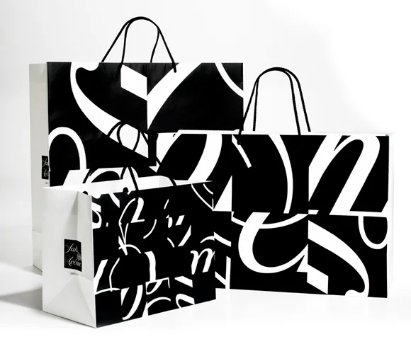
The identity design for Saks Fifth Avenue by Pentagram is a good example of contrast extraction used in packaging design. Wanting to emphasize the idea of constant change, surprise, scale and energy, the design is made up of the Saks logo reversed in white set over a black square. The square is then divided into a grid of 64 smaller squares which are then shuffled and rotated to form variations. Each square can be used on their own or in combinations to form abstract compositions. The overall aesthetic however maintains a recognizable consistency.
5. Perceptual Problem Solving
This principle is based on the idea of having a more pleasing visual experience by making an object less visible vs instantly recognizable. When we look at a simple scene, our brain is constantly resolving ambiguities, searching for patterns and comparing current information with memories and expectations. By showing less information, our brains are able to put the missing information together. Similar to the perceptual grouping and binding, when our brains solve the problem by recognizing the object, we are rewarded with an ‘aha’ moment of discovery.
The logo created for Circus of Magazines™, designed by Olivier Courbet, is a good example of perceptual problem solving. Here the mark combines an open magazine with a circus tent. Courbet has eliminated extraneous information of the circus tent and magazine leaving us with just the essential outlines of a tent and shadows of an open magazine. Our brain, by taking this current information and combining it with what we know of an actual circus tent and open magazine, is able to distinguish these shapes as such.
6. Symmetry
Symmetrical objects trigger a response in our brain as an important detector for predator, prey as well as choosing a mate – all of which tend to display symmetrical features. Evolutionary biologists suggest that health and beauty are associated with symmetry where as non symmetry is associated with genetic mutation caused by disease or infection hence our propensity to choose symmetrical features over non symmetrical.
Lavernia & Cienfuegos’s package design for EXTREM premium ham is an elegant example of symmetry in package design. Symmetry is used on both the container and miniature pig handle. The packaging immediately communicates premium through its simplicity.
7. The Generic Viewpoint and Bayesian Logic of Perception
According to Ramachandran and Hirstein, our visual system abhors interpretations which rely on a unique vantage point and favours a generic one – particularly when a generic viewpoint presents us with a predictable or likely solution when interpreting a visual scene. Take Shigeo Fukada’s Lunch With a Helmet On which is a sculpture created with 848 forks, knives and spoons. With a strategically placed light, the shadow cast off the cutlery reveals what appears to be a motorcycle. The light represents the generic viewpoint. If the light were positioned elsewhere, the shadow would appear much different. Our mind prefers to interpret this generic view of the shadow because of the clear perception of the motorcycle.
Nicola Yeoman’s letter “D” created with a chaotic arrangement of chairs is a great example of the generic viewpoint. Her “T” for the New York Times, created by draping fabric in a forrest is another great example used in design.
8. Metaphor
Ramachandran describes a metaphor as such, “A metaphor is a mental tunnel between two concepts or precepts that appear grossly dissimilar on the surface.” Similar to perceptual problem solving and perceptual grouping, metaphor can also give the viewer a rewarding emotional response by allowing them to discover a deeper connection between the two concepts.
This ad for the Roy Castle Lung Foundation is an effective use of metaphor in visual communication design. The resemblance of the two cigarettes to a double barrel shotgun clearly allow the viewer to make the deeper visual connection of the two concepts.
9. Repetition, rhythm and orderliness
It goes without saying that repetition, rhythm and orderliness are quite prevalent in visual communication design. Each of these qualities induce the perception of regularities that reduce the effort for recognition. Basically these qualities make it easier for our eyes to make things out.
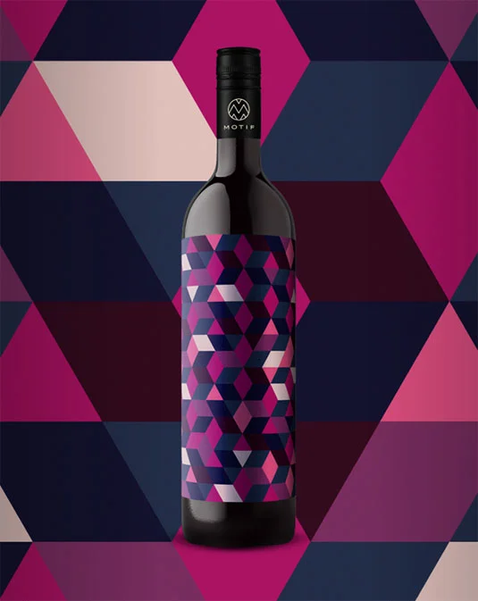
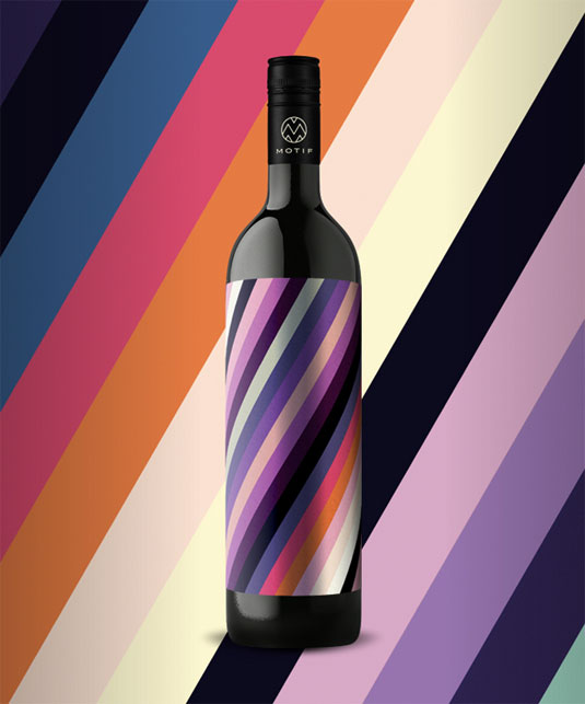
Packaging design for the Motif line of wines uses repetition, rhythm and orderliness via various colourful patterns as a way to visually describe their individual wines. Each wine has a distinctive pattern and array of colours which, when combined, alludes to the flavour. This clever use of pattern and colour is also a good example of how shape symbolism can effect taste and flavour of texture of foods and beverage as noted in a paper by Charles Spence and Mary Kim Ngo in Flavour Journal (2012). Mouse over each image to see the description used for each wine.
10. Balance
Like symmetry, repetition, rhythm and orderliness, balance is easy for our brains to process. It is a central feature that contributes to the organizational structure of aesthetic visual images. The organizational structure of a visual image effects the way it is perceived. Children, after the age of 9, incorporate organizational structure in their artwork and align elements along a vertical and horizontal grid (Golomb, 1987). Adults create designs in which the geometric center and the center of balance are closely aligned (Locher, Stappers, & Overbeeke, 1998).
This mural by Doe Eyed for Whole Foods shows a good use of balance in environmental graphics. The various illustrations of fruits and vegetables with ranging colours and shapes are arranged in such a way giving us visual balance.
As visual communication designers much of what we do, in terms of the act of designing, is based on intuition and experience. Some designers use these principles subconsciously where as other perhaps, consciously. Does this suggest that tapping into and controlling an aesthetic experience can be an applied science in which the use of these principles become fundamental? It was philosopher Alexander Gottlieb Baumgarten who, in 1750, defined the term 'aesthetics' as "the science of sensual perception" which today has been redefined to reflect a more philosophical discipline dealing with beauty, its perception and arts. With new science techniques emerging that are allowing us to measure and quantify brain activity associated with art and design, perhaps Baumgarten's term is more relevant today than ever before.
Ramachandran and Hirstein's 10 principles:
1. The Essence of Art and the Peak Shift Principle
2. Perceptual Grouping and Binding
3. Isolating a Single Module and Allocating Attention
4. Contrast Extraction
5. Perceptual Problem Solving
6. Symmetry
7. The Generic Viewpoint and the Bayesian Logic of Perception
8. Art as Metaphor
9. Repetition, rhythm and orderliness
10. Balance
Behind The Design takes a look interesting tidbits in the world of design. From the history of identities to pictogenes, geons and the science of visual communication. Follow us as we explore those things you may never would have thought of.


